Loch Duart has introduced its new brand to celebrate its premium positioning in the market and show pride in its Scottish roots. The first major change to its brand since it was founded over 21 years ago, Loch Duart engaged specialist brand and packaging design agency, Hunger, to handle the project.
Andy Bing, Loch Duart’s Sales Director talked about the Loch Duart rebrand.
What motivated Loch Duart to work with designers to update the company brand and what was the brief you gave to Hunger for the project
After 21 years it was time for a ‘refresh’. The company is renowned for the unrivalled quality of our salmon and we needed a more luxurious, premium feel to the branding to reflect that.
How did your collaboration with Hunger work through this project?
It involved a very thorough search into what Loch Duart means to its customers, its staff and its community. Then assimilating as much of the amazing landscape and seascape (that is integral to our operation) into the creative content as possible.
Which aspects of the new brand are you most excited about and what does it convey to your customers about Loch Duart Salmon?
Our original brand design and logo have served us so well. If memory serves me correctly, we paid an Aberdeen designer £240 for the creation of that in 1999 and it has made a very positive contribution to our identity over the years. But we wanted an updated brand to reflect just how far Loch Duart has travelled to become a producer of the highest quality, Scottish farmed salmon, which truly is unrivalled. Hunger’s design cleverly combines visual keys relating to the unique environment in the north west of Scotland with a tremendously luxurious feel.
![]()
Melissa Preston, Design Director at Hunger spoke about the project.
How would you summarise Hunger’s approach to working with brands like Loch Duart in the premium food sector?
Brands like Loch Duart have so many incredible stories of care and quality to tell. For Hunger, it’s all about understanding these stories. Immersing ourselves in every element from proprietary broodstock to cleaner fish, low stocking density to the salmon’s wilder features, then distilling all this knowledge down to capture the essence of the brand. For Loch Duart it was clear their quality and care was like no other; this was unrivalled Scottish salmon.
What were your initial thoughts about how Loch Duart could develop an already established and recognised brand?
Loch Duart’s previous branding had all the right component parts, but they weren’t executed to the quality of the product itself. Our job was to harness the equities that had clear value and evolve them to tell a more premium visual story. Essentially, we needed Loch Duart’s brand to match the quality of its salmon.
What did you identify as the main challenge in this project?
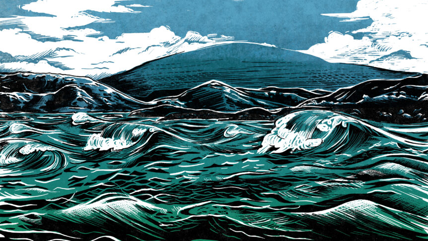
This was the first time Loch Duart would be seen by consumers rather than food service, so it had to make an immediate and strong first impression. Every element was created to tell a story of provenance with unrivalled care and quality, from the beautifully crafted shield to the bespoke illustration which transports you to wild north-westerly waters.
What was the thinking behind the new logo and the additional illustrated elements?
With our new logo and additional design assets we wanted to tell a strong provenance story, put the salmon at the heart of the branding and bring an authentically Scottish premium feel to every element that the brand touched. The evolution of the Loch Duart shield tells the story of Scottish salmon born and raised by Loch Duart on the north west coast of Scotland. This alongside the crafted provenance stamp, a bespoke, made in Scotland seal and the illustration of our coastline visually bring to life the craft and dedication that Loch Duart brings to raising every fish.